It’s been 2 years since the 2021 Wikidata map. Yesterday I was sitting in the WMDE office and Lydia raised the point that we hadn’t made a map in quite some time (T331124).
Maps used to try to generate in a somewhat automated fashion, but the process was rewritten in 2021 and still needs to be run by hand with someone with access to the WMF analytics platform.
Thankfully the documentation of the updates still works perfectly, and the whole process of the map generation only took a few minutes!

“Intensity”
One of the settings for map generation is intensity. The UI currently allows a range between 1 and 100, with the map above being on the 100 setting.
In a nutshell the intensity the % of a pixel that a single coordinate relating to that pixel will create. So 100 intensity means that each pixel only needs a single coordinate for that pixel to be white. But intensity of 5 means that 20 items would need to relate to the pixel in order to end up being fully white.
In code that looks something like this
ctx.fillStyle = `hsl(23, 100%, ${intensityPercent}%)`;Code language: JavaScript (javascript)And to guide you through some of the various colours you might see for levels 1, 5, 25, 50 and 100.
This is why intensity level 100 (or at least 50) is important, to ensure you can see areas that only have one or two items per pixel represented on the full-size map.
So lower intensities, everything has a reddish glow, such as intensity level 5 below.

Diff
The diff representations are once again generated using Resemble.js, and the pink pixels indicate that between the 2021 and 2023 images, those pixels changed in intensity.
So in those areas either geocoordinates were added or removed.
Looking at the diff images for intensity 1 below we can see changes across the board, though you really need to zoom in to see the lower concentration areas.

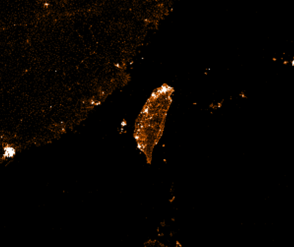
One area that jumped out to me looking at this diff was Taiwan, which you can see as a slight curve of pink pixels toward the right-hand side of the map.
When using the UI you can easily switch between the 2021 and 2023 maps to create a little diff showing the change (here at intensity 5)
1 thought on “Wikidata Map in 2023”