It’s time for the first 2018 installation of the Wikidata Map. It has been roughly 4 months since the last post, which compared July 2017 to November 2017. Here we will compare November 2017 to March 2018. For anyone new to this series of posts you can check back at the progression of these maps by looking at the posts on the series page.
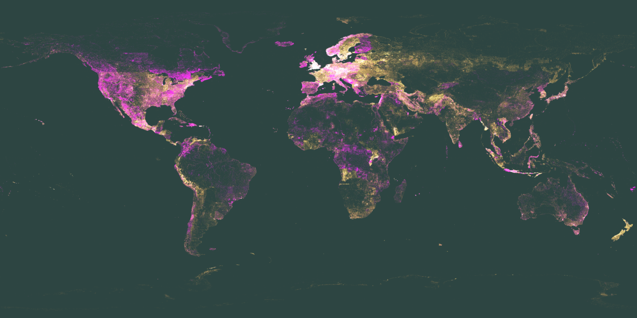
Each Wikidata Item with a Coordinate Location(P625)will have a single pixel dot. The more Items present, the more pixel dots and the more the map will glow in that area. The pixel dots are plotted on a totally black canvas, so any land mass outline simply comes from the mass of dots. You can find the raw data for these maps and all historical maps on Wikimedia Tool Labs.
Looking at the two maps below (the more recent map being on the right) it is hard to see the differences by eye, which is why I’ll use ImageMagik to generate a comparison image. Previous comparisons have used Resemble.js.

Read more