It’s been over a year since I last posted about the Wikidata Map, and my last blog only used coordinate data from the end of 2019. At WikidataCon 2021 we finally showed off the new map tool that we have been working on, and with that came some fresh 2021 data!

Updated interface
Back in 2013 when Denny & others first created the Wikidata map, there was a webpage and JS tool for looking at the visualizations with various overlays. As the data set got bigger the JavaScript was no longer able to cope with the volume of coordinates and calculations at runtime. To this date I can’t even find any screenshots of the tool interface, but there are some screenshots of the generated maps in an old post of mine from 2015.
For many years we had to cope with static images that were built after each weekly JSON dump and published to the wikidata-analysis tool.
In 2020 we started looking at how the map could be revamped, with the idea of moving toward an interactive experience again. After a few interesting failed attempts we finally got to a point where we had a stable map at the end of the pipeline.


During WikidataCon 2021 I realized that it wouldn’t really be a WikidataCon for me without a rushed last-minute update to the Wikidata map. So we slapped on a few extra controls, generated a bunch more data, and tada!
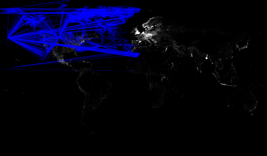
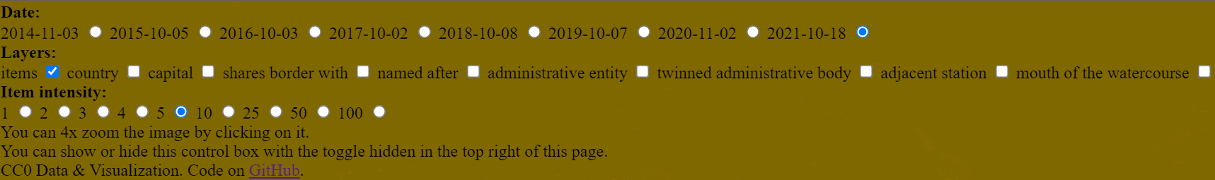
This final interface revamp is currently hosted on Github pages, and includes yearly data from 2014 to 2021 and multiple relationship overlays including country, capital, shares border with, named after, administrative territory, twinned administrative body, adjacent station, mouth of watercourse, as well as intensity toggles for pixel / individual item brightness.
Be sure to check out the live tool on Github pages, code on Github and snapshots from 2021 and before on Commons.
Updated data set
The data behind the UI in 2013 was generated from the first Wikidata JSON dumps, and coordinates were extracted in Python. As the data set got bigger and bigger the Python code got slow and needed to be rewritten.
The dump scanning code was rewritten to survive another 5 years making use of the Wikidata Toolkit. But as time passed this dump scanning method also got too slow and memory intensive for a single process. The same output was kept though, which included 2 rather verbose files that looked something like the below, one with coordinates, the other with relationships.
{
    "Q202445": {
        "label": "Cabourg",
        "y": -0.13333361111111,
        "x": 49.283333611111
    },
    "Q202446": {
        "label": "-",
        "y": 13.54763611,
        "x": 49.90032222
    }
}Code language: JSON / JSON with Comments (json)
{
"P403": {
"Q4161321": [
"Q4537685"
],
"Q4218828": [
"Q4430628",
"Q1009412"
]
}
}Code language: JSON / JSON with Comments (json)At some point, the WMF Analytics team started loading the Wikidata JSON dumps into their Hadoop cluster. And this led to an initial prototype rewrite in April 2020, which was continued in September 2020. The idea here was to move toward an interactive experience again, but rather than provide a list of coordinates and entity IDs to Javascript, precalculate pixel reference that could be drawn on a canvas.
The whole “new” data ingestion pipeline at the point of writing this can be found documented in the code docs. It all starts with a simple query extracting coordinates.
SELECT
    id,
    get_json_object(claim.mainsnak.datavalue.value, '$.globe') as globe,
    get_json_object(claim.mainsnak.datavalue.value, '$.longitude') as longitude,
    get_json_object(claim.mainsnak.datavalue.value, '$.latitude') as latitude,
    snapshot
FROM wmf.wikidata_entity
LATERAL VIEW explode(claims) t AS claim
WHERE snapshot=${WIKIDATA_MAP_SNAPSHOT}
    AND typ = 'item'
    AND claim.mainsnak.property = 'P625'
    AND claim.mainsnak.typ = 'value';Code language: PHP (php)
The coordinate and relation data from the dumps is ultimately turned into some very lean CSVs that can easily be streamed in JavaScript.
posx,posy,count
3933,898,7144
3761,812,6263
posx1,posy1,posx2,posy2
6111,1644,6126,1766
6078,1911,6126,1766If you want a nice diagram covering how all the different stages of processing tie together, you can also find this in the Github repo.
The future
The UI is currently a bit slow on machines with less resources. There is no reason to have the image rendering happening JavaScript, and a nice addition in the future would be to do this server-side, and simply have the interface download multiple transparent image layers and play around with them, switching them out etc.
Data generation is currently a manual set of documented steps, and must be completed every time we want to render new images. It would make much more sense to fold the queries into some of the WMF analytics infrastructure that is designed for doing exactly this sort of thing.
I’m not a huge fan of the fact that this is currently only on Github pages, but that’s where it ended up at the end of our prototyping and in order to have something to show at WikidataCon. Ideally, this should end up as a tool on toolforge :)
Right now there is only yearly data included in the tool, but it would be great to have monthly data, with a slider and optional JavaScript-based comparison in the UI, similar to what I did in a previous blog post such as Wikidata Map July 2017 where areas of change are highlighted in pink.
3 thoughts on “Wikidata Map in 2021”